Guides and best practices
Dark Mode Changelog
Nov 12, 2024
•
3
minutes read
Guides and best practices
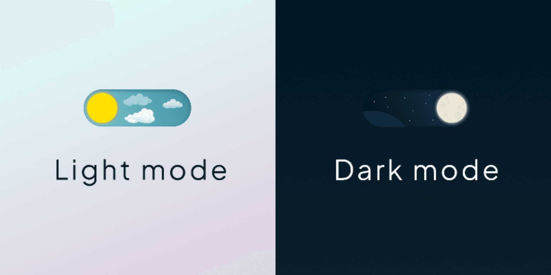
Dark mode isn’t just a trend; it’s a user preference that enhances the overall experience on your website. As more users opt for this visually soothing option, it’s essential to ensure your site supports both light and dark modes effectively. In this guide, we’ll dive into the technical aspects of implementing a changelog that looks great in both settings, focusing on why dark mode matters, how to set up your site for color schemes, and how to add the Released page widget.
The Importance of Dark Mode
Let’s face it: dark mode is here to stay. Users are increasingly gravitating towards it for several reasons:
Reduced Eye Strain: Dark mode can be easier on the eyes, especially in low-light environments. It minimizes glare and can help reduce fatigue during extended use.
Battery Savings: On OLED screens, dark mode can save battery life since black pixels are essentially turned off. This is a win-win for users who are conscious of their device’s power consumption.
Aesthetic Appeal: Many users simply prefer the sleek, modern look of dark mode. It can make content pop and create a more immersive experience.
By supporting dark mode, you’re not just keeping up with trends; you’re enhancing usability and user satisfaction.
Preparing Your Site for Color Schemes
To effectively implement dark mode, you need to ensure your site is set up to support color schemes. Here’s how to do it:
Define Color Variables:
Start by defining CSS variables for your color schemes. This allows for easy management and ensures consistency across your site.
Apply the Variables
Use these variables throughout your CSS to ensure that all elements adapt to the user’s preferred color scheme. For example:
Integrating the Released Page Widget
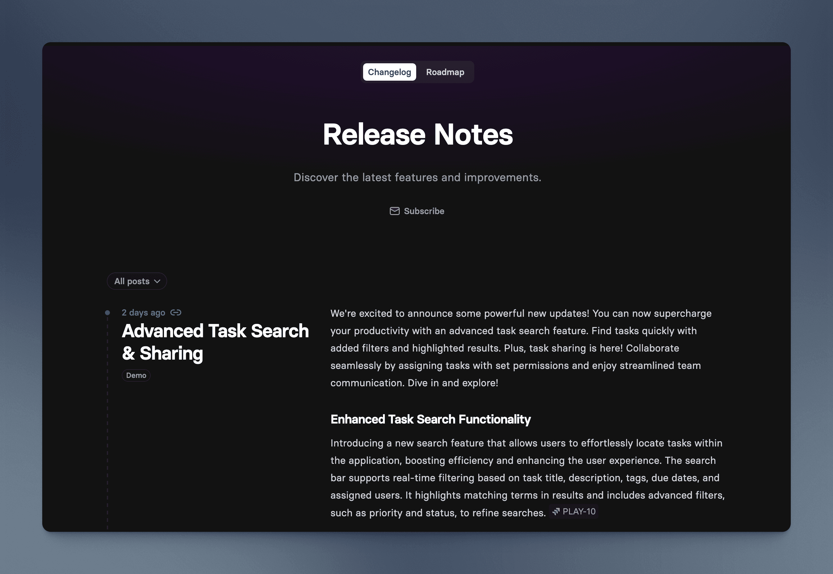
Now that your site is ready to support color schemes, it’s time to add the Released page embed for your changelog. Here’s how to do it.
First, head over to the Released documentation to view the instructions for integrating the
Load the script
Add the following code snippet to the <head> section of your site.
Place the embed code in your page
Add the following code snippet to the <body> section of your site. The page content will render where you position the element.
After adding the embed, test it in both light and dark modes. Ensure that it displays correctly and that all text is readable. This is crucial for maintaining a consistent user experience.
Demo
You can find the full code on CodePen. To test it out, change your system settings to dark more and see how the page background and the embed adjust accordingly.

Embrace the Dark Side
What do you think? Dark mode looks pretty neat. But it's also a far superior reading experience at night.
So, roll up your sleeves, dive into the code, and make your site shine in every setting. Your users will appreciate the effort, and you’ll be one step closer to providing an exceptional experience. Happy coding!


