Weekly
Single
Users
Professional

About Figma
Figma is a web-based collaborative design tool used for creating user interfaces, prototypes, and other visual designs. It allows designers to work together in real-time, making it easy to collaborate and iterate on design projects.
Summary
Figma follows a similar approach to Sketch in presenting release notes, dividing them into "Releases" and "What's New."
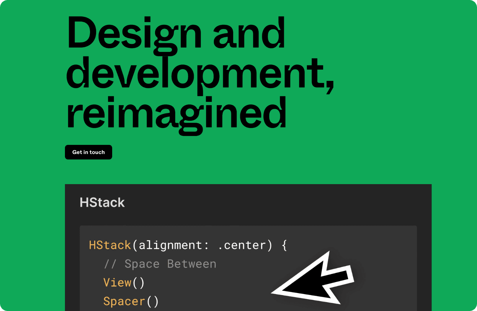
The "What's New" page is highly visually, presenting features in individual feature blocks with a link to the documentation. It serves as a high-level marketing showcase for major updates.
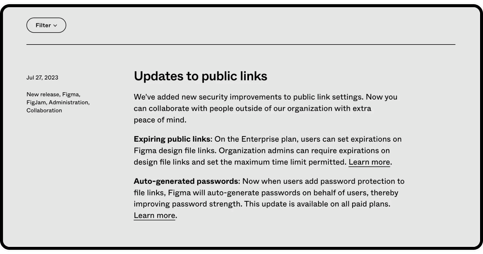
On the other hand, the "Releases" page offers more traditional release notes, focusing on single new features or improvements. However, it does not mention smaller improvements or bug fixes, which could be a valuable addition for users seeking a comprehensive view of changes. It also doesn't contain any images, making the updates fairly boring to read.
What we love
Clear organization with "Releases" and "What's New" sections.
Highly visual "What's New" page with feature descriptions and links to detailed documentation.
Quick grasp of major updates due to high-level marketing focus.
Changelog vs marketing page
Figma's nailed it. Instead of burying us in tech jargon, they've split their updates: "Releases" for the nitty-gritty and "What's New" for the shiny stuff. It's like having both the engineer's manual and the user's guide. Pick your flavor.

Remember when manuals were boring? Figma doesn't. Their "What's New" is a visual treat. It's not just a list; it's a show. And if you're itching for the deep dive, they've got links ready to take you there. It's like window shopping with a backdoor to the workshop.
High-level marketing focus
Figma's not just throwing updates at us; they're telling us stories. Big updates aren't just lines in a changelog; they're headlines. It's a breath of fresh air in a world of endless, bland release notes. They know their audience, and they're speaking our language

What we don't love
"Releases" page lacks smaller improvements and bug fixes.
Limited visual elements in the "Releases" page.
Figma's "Releases" page? It's got the big stuff down, no doubt. But where's the love for the little things? Those tiny tweaks and bug squashes that make our day smoother? Sometimes, it's the small touches that make the biggest difference. We're missing those in the spotlight.
For a platform that's all about design, the "Releases" page feels... well, a bit bare. We get it, it's the serious section. But a sprinkle of visuals wouldn't hurt. Let's see those changes, not just read about them. After all, a picture's worth a thousand words, right?
Template
Get started with your release notes using the template provided below. The content serves as an example of the desired tone of voice, which you can adopt for your own notes.


