Blog Article
How We Built Magical Release Notes Templates


Jens Schumacher
Mar 1, 2024
•
4
minutes read
Article
Release notes? In one click? Yes, please! That was the resounding message from our early beta users. They envisioned a ßWe get it. Our mission is all about making product updates frictionless – crafting clear updates shouldn't be a chore. But before we could unlock the magic of templates, we needed a solid foundation in place...
In November 2023, we finally had that foundation in place. Of course we didn’t want to build a standard, boring templates feature. We wanted to make it dynamic and easy to create. We decided what we needed was:
The ability to present improvements in paragraph and bullet form. For major features and minor improvements.
Select the types of issue to present in each section.
The ability to adjust the AI for each section. This would allow for creating one template for a regular product update. And, another for a security announcement. Each with their own structure and tone of voice.
We wanted to have a short intro, with the ability to summarize the post.
We needed meaningful titles. Using dates as a post title is not a great practice.
And finally, we needed templates to be simple to create. No complicated markup language that people need to learn.
It became clear that release notes templates would be our biggest feature since we launched Released. It required:
We made major adjustments to the template editor. They provide the simple WYSIWYG experience we aimed for.
Our template engine needed to generate the issue content first. Then summarise the generated content to create the intro and the title.
We needed to provide users with some insight into what the generated outcome would be.
The design process
Now we had clear requirements (the actual requirements were a little more detailed). The next step was to get a design and prototype ready.
Design 1
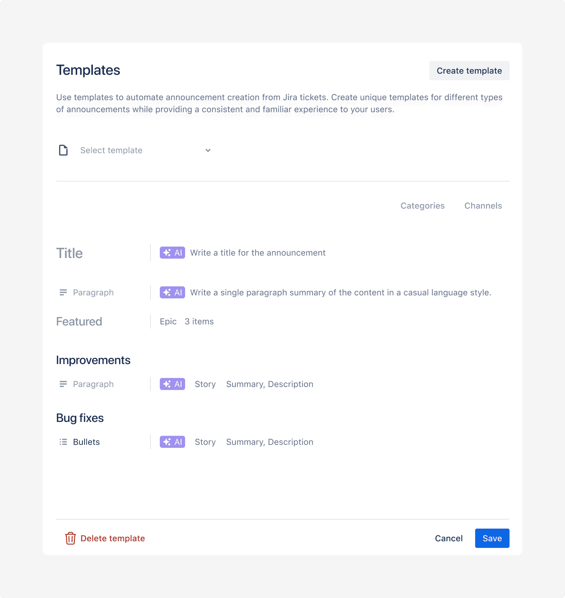
In this design, we had a template dropdown at the top. You could define the category for posts and the default channels they would be posted to.
We decided to remove those options. Categories and channels often aren’t tied to a specific template. Those options will become more relevant once we enable fully automated posts.
We aimed to show the style and options for each panel.
The issue was that the template blocks didn’t look very distinct. And the template as a whole seemed to lack structure.
Design 2
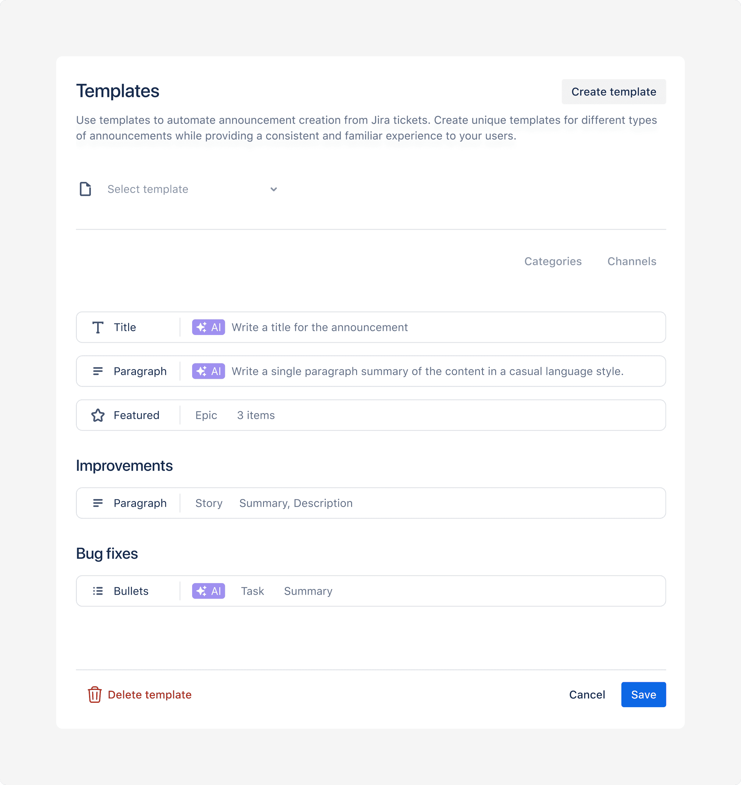
In this design we added outlines around the blocks. This more clearly distinguishes the blocks from the rest of the content.
But we felt it didn’t communicate well enough how the final post might look like.
Design 3
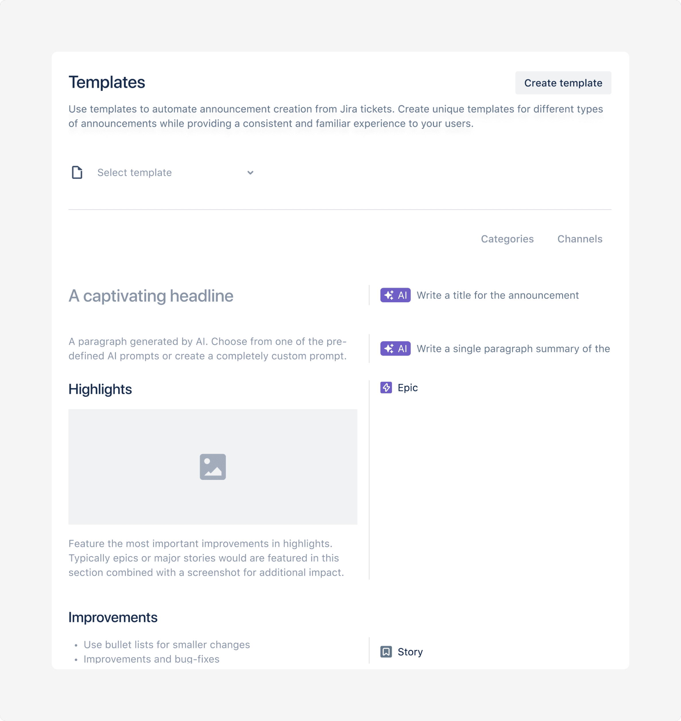
We experimented with a more visual approach. Still with the configuration options to the right.
This was getting closer to what we imagined. But we also realized that we are adding a new pattern with our panels. For no good reason. Forcing users to think when we don’t want them to.
Design 4
We then transitioned to a more traditional panel UI that users are familiar with. Moving the configuration options into a dropdown when clicking on a block.
We also moved the template selector to an overview page. Categories and channel option were also removed. This made the whole page more focused, and less busy.
We were happy with this approach, and started user-testing this design. That's when we discovered the placeholder / help text was confusing. It was confusing some usability testing candidates.
Design 5
We replaced the text with a skeleton. We decided to show the help text in a tooltip when you hover over the sections.
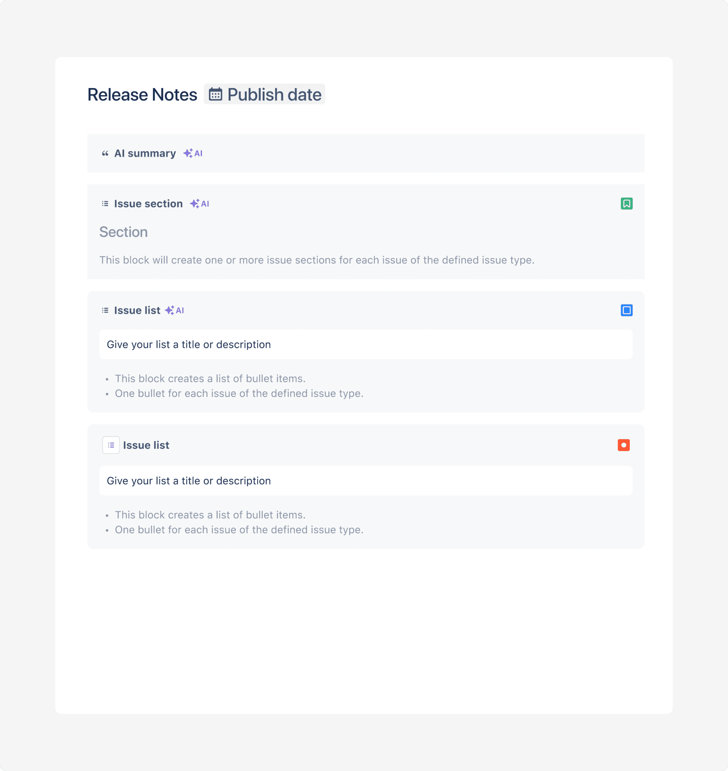
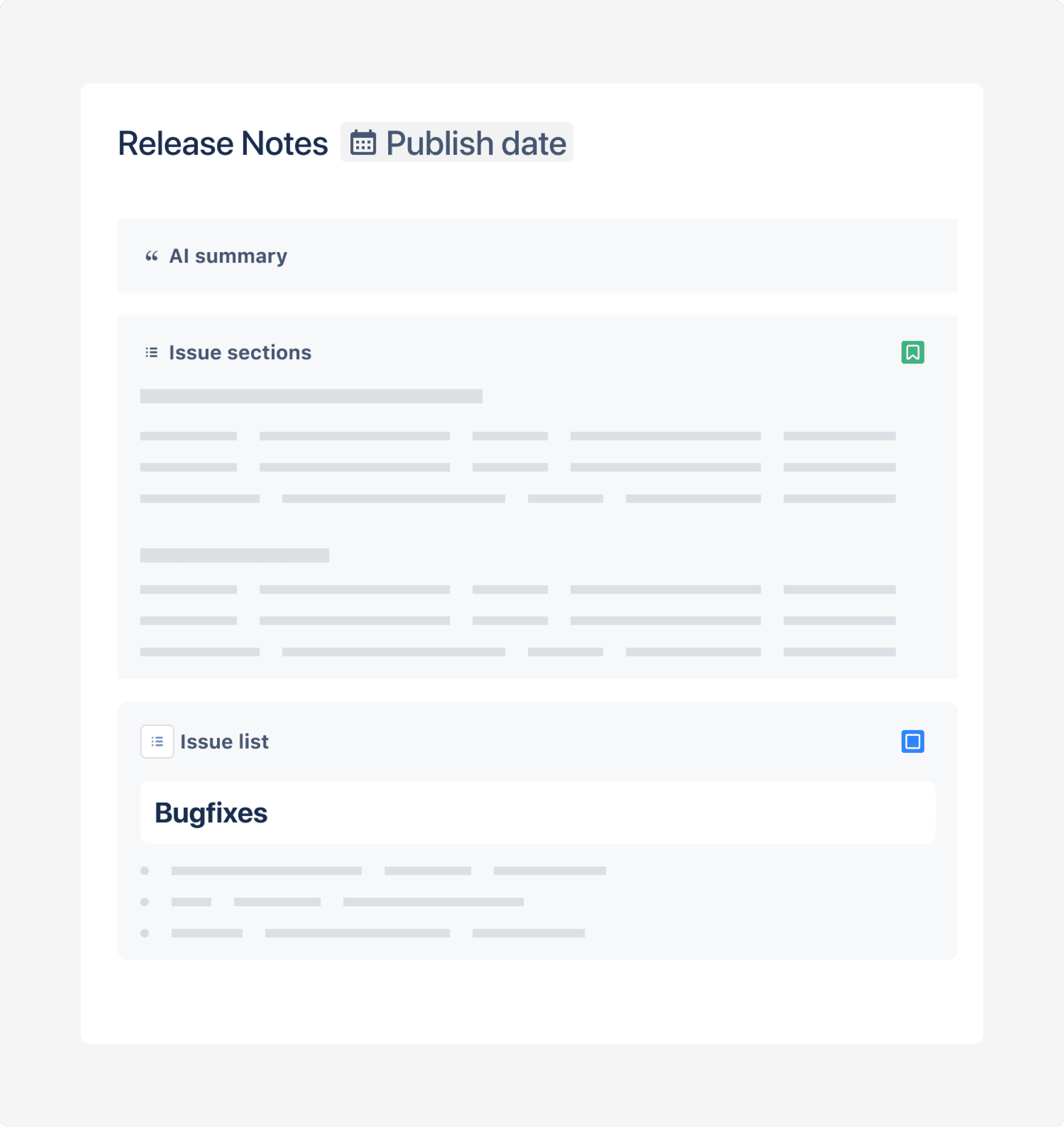
But there was still one problem. It wasn’t clear to users that the issue sections actually renders one or more issues.
For the bullet list, that was intuitive. But, not for the issue section. Users assumed they would have to add a section for each improvement and didn’t understand how.
Final design
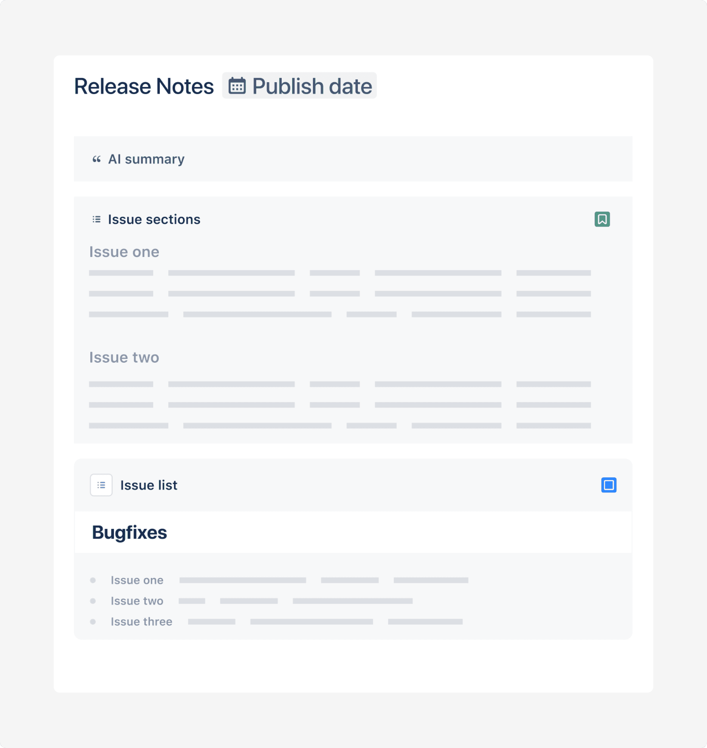
After some tweaking, we settled on a design combining skeleton and text. This design highlights the section can contain multiple improvements.
The bottom line
Getting templates right took a lot of testing and iteration. But it pays. Users are loving the feature. Not only because it saves them a ton of time. It's also delightful to use. With just one click, you can easily create a full product update… and thanks to AI, it feels almost like magic.
Subscribe to our newsletter
Get the top articles of the month, delivered to your inbox.


